 | ||||||
 | ||||||
 | ||||||
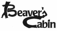 | ||||||||||
Beaver's Cabin logo designed for the cafe/restaurant located in the small historical town in Ontario, Canada. The interior and exterior of the cafe/restaurant was all wood finish and had at the entrance huge trees. These wooden surroundings suggested the name. The design of the logo incorporated tree branches and shape of the letter "C" to express the nature of the name. | ||||||||||
 | ||||||
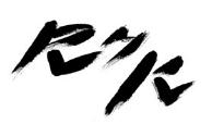
Jabotype Energy Transfer Inc. logo was designed for the company involved in exporting of infrared heaters. The connection of the letters "E" and "T" is to suggest the transfer of the heat from heaters as well as transfer of the ownership. The colour of the logo is red to symbolize the heat. | ||||||
 | ||||
RHK logo stands for Richmond Hill Karate, which is the karate and fitness center, located in Richmond Hill, ON, Canada. The design of the logo is to show the influence of Japanese Kanji brush lettering. The shapes of the letters are to symbolize karate techniques and movements. | ||||
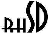 | ||||
RHSD logo was designed for Richmond Hill Sound Diagnostic. It is for a medical clinic. The requirements were to create a simple and elegant logo, which would stand out and be unique and to include the first letters of the name. | ||||
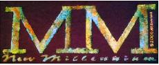 | ||||
MM logo was designed for the New Millennium, 2000 year T-shirts. The composition was done using the Greek numbers. | ||||
John PauL II Cultural Centre in Mississauga, Ontario, logo designed for the competition (was awarded 2nd place). Design Intends of this Logo:
| ||||
 | ||||